YouTube
Great sir 😊
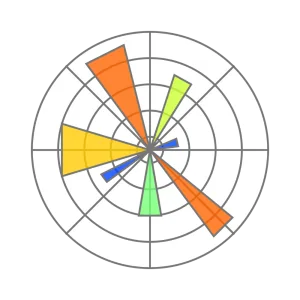
Master the art of Data Visualization using Python's most powerful charting library. Build stunning, publication-ready charts and graphs from scratch — bar, line, scatter, pie, heatmaps, and more. Turn raw data into clear, compelling visual stories that impress in reports, dashboards, and real-world projects.
 Matplotlib
This course takes you from zero to confident in Python Data Visualization using Matplotlib — one of the most in-demand skills in Data Science and Analytics. You’ll learn how to create, customize, and style a wide variety of charts and graphs with clean, readable Python code. Every concept is explained with real datasets and hands-on practice, so you’re always building something meaningful. By the end, you’ll have the skills to visualize any data professionally — whether it’s for a project, a portfolio, or your next job.

Co-founder & Manager
14+ years of experience in digital transformation, leading teams of 15+ members and delivering 160+ projects for organizations like Lakshmi Machine Works, Milacron, Schneider Electric, Aatomz Research, and Variablz Technologies. AI innovator with a patent approved by the Government of India, with strong expertise in Data Science, Data Analysis, Business Intelligence, and Software Development.
Great sir 😊
Great sir 😊
Yes, basic Python knowledge is recommended. You should be comfortable with variables, loops, and functions before starting this course.
Yes! All video explanations are in Tamil, making it easy to understand even complex visualization concepts clearly.
Just Python, Spyder, and the Matplotlib library u2014 all free to download and install. Setup guide is included in Module 1.
No, this is entirely FREE program published on Youtube
The total course duration is around 6 hours. Most students complete it in 3u20134 weeks at a comfortable pace.
You can post your questions in the YouTube Community section and our team will respond within 24u201348 hours.
Yes, the course is fully accessible on mobile, tablet, and desktop through Youtube platform.
You get lifetime access to the course u2014 including any future updates we add to the content.
A professionally designed, industry-aligned classroom program built exclusively for job seekers who are serious about becoming a Data Analyst and Business Intelligence Professional This course goes beyond basic dashboards and reports — it trains you to gather business requirements, analyze complex datasets, translate data into actionable insights, and communicate findings to stakeholders at every level […]


This Pandas course is a complete, job-oriented program designed for freshers, students, and career switchers who want to build strong data analysis skills using Python. Starting from the fundamentals, you will learn how to work with Series and DataFrames, import data from multiple sources, clean and preprocess datasets, and perform real-world operations step by step.

Master Data Science from scratch—no prior coding experience needed. This program takes you from Python fundamentals through Pandas, NumPy, Matplotlit, Seaborn, Sci-kit learn, and machine learning, building practical skills at every stage. You’ll work on real-world projects and build a portfolio that demonstrates your ability to solve business problems using data. Dedicated placement training covers […]